HotChalk Rebrand Project Corporate Rebranding Goal Rebrand HotChalk to better represent its corporate goals Role Worked with external branding agency and collaborated on creative direction; assisted in the website development A New Direction When I first joined HotChalk, the company had just gone through a rather substantial shift in direction. Unfortunately, the brand hadn’t caught up with that change. In lieu of taking on this rebranding in-house with limited resources, I decided that the best course of action would be to outsource to an external branding agency that could take on the large workload and tight deadlines. We worked closely in developing the corporate mission statement, logo and brand guidelines, and a new corporate website presence. At one point, the CEO (who was very attached to the out of date brand) stepped aside while I continued working with the agency on execution. The result was a much needed corporate facelift for HotChalk which helped pave the way for future corporate investments. Old Logo Design New Logo Design Brand Implementation & Growth Once the agency had completed their branding and design work, I managed the development of the website internally so that we could determine and control the environment. In doing so, we were able to develop systems to easily maintain and update the website through the many additions, revisions and iterations its had over the years. One large addition was the development of the HotChalk Partner Network. I designed and developed a new B2B page on the corporate website to support our partnerships team in securing additional business, nursing, and educational partnerships. Additionally, I designed a new careers page, hosted by Jobvite that allowed the Human Resources department to post job openings on their own. I worked with Jobvite to ensure the website was developed as designed. Print Marketing Branding efforts continued beyond digital and into print-based corporate marketing materials. One example, is a brochure highlighting the various HotChalk services offered to University Partners. This was created for the sales team as both a leave behind printed piece as well as a digital PDF that can be emailed. Back to Portfolio
Online Student Application
Online Student Application Project Online Student Application integrated into Salesforce Goal Design an online application to compliment existing branding and to improve ease of application completion for the user Role Scope, Wireframes, Design, Work with offshore development team, QA, Project Management As part of the on-boarding package with new University clients, we developed a student application that feeds directly into our Salesforce system allowing us to send reminder emails and contact applicants easily. The application was designed to fulfill all University requirements while also incorporating Salesforce limitations and marketing requirements, all while adhering to the University’s existing style guide. Existing User Login Step 1 – Create Profile Step 2 – Applicant Information Step 3 – Academic Information Last Step – Verification The application has been instrumental in enrolling students into the Online Campus programs. Adler University actually redesigned their own ground application to mimic ours. Back to Portfolio
COE Application
COE Application Project Online Student Applicationintegrated into Salesforce Goal Design an online application to compliment new brand launch while representing three Universities Role Scope, Wireframes, Design, Work with offshore development team, QAt Process Map This application project was a bit more complex in that we needed to combine three separate student applications into one but still make sure the user was able to determine which program they wanted to apply for. The first step was to map out the user flow and process to ensure that all conditions were accounted for and that users were taken to the correct school application. Wireframes Using this process map as a guide, I wireframed out the application to make sure that the flow made sense and that all data fields wereaccounted for. The next step was to design the application UI to becomplimentary to the new website that it would be launching with. By carrying over the navigation bar and contact icons, the user easily identifies this application to be part of the website they came from. In order to help the user identify which of the three Concordias they are applying for, I added in a space for the logo and description to display next to the program they selected. Development Once all approvals were received, I proceeded to work with our external contractor to develop the application in the force.com environment. I developed a detailed instructions document as a guideline for the developers along with various CSS and images needed to develop the application. There was a short timeline and solidified launch date that this needed to be completed by so I couldn’t developed functional prototypes to hand off. Instead, I worked closely with the developers on a daily basis to review the progress, provide feedback, detail bugs and issues, and make sure the application was performing as required. Due to the close communication, we were able to launch the application alongside the website launch as originally scheduled. Back to Portfolio
HotChalk Education Network Website
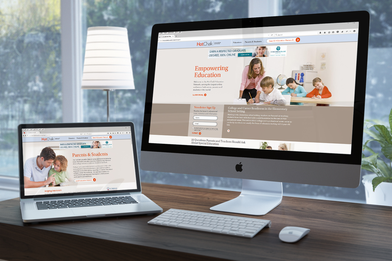
HotChalk Education Network Website Project Organic Website Goal Showcase our network of educational publishers while utilizing organic traffic to market our resources to K-12 teachers Role Scope, Wireframes, Design, Development and QA (aka: all of the above) Plan Under a very tight deadline (less than 8 weeks), I worked with various product owners to develop a plan that could be executed in time for a high-profile event promoting the HotChalk Education Network. Design After finalizing the sitemap, content structure and wireframes, the next step was to align the Education Network brand and website design with the newly launched HotChalk brand/website. I wanted to bring it under the HotChalk umbrella but also give it its own unique look and feel. I chose to focus on some of the HotChalk accent colors which I carried throughout the website design. Corporate colors were then used as accent pops of color. Execute Once the comps were approved, I worked with the developers and writers to execute the site – this included responsive development so that the site was optimized for mobile users as well as desktop. At the end of the day, we delivered a fully responsive and functional website on time for the event. Desktop Mobile Back to Portfolio
LinkedIn Lead Accelerator Campaign
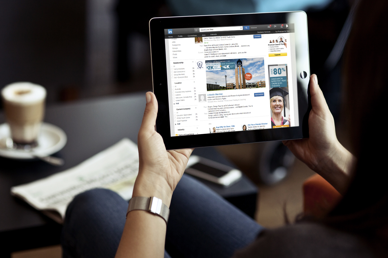
LinkedIn Lead Accelerator Campaign Project User Re-targeting Campaign Goal Brand Recognition; Audience Nurture; Lead Generation Role Strategy and Design; Worked with LinkedIn/social media/content teams on execution We met with LinkedIn to test out their Lead Accelerator program to test out ads for our flagship client, Concordia University – Portland. Working with LinkedIn, we developed a campaign strategy to target 4 main audiences (streams). Within each stream, I designed themes to be presented to the user in “waves” – a user was served ads in a set sequence across a variety of platforms (LinkedIn Sponsored Updates, Facebook Ads, Display Ads). Each theme was targeted specifically to each audience to nurture their interest in a particular subject matter. Generic Ads Target audience lands on campus specific/overview pages (SEO, PPC); ads promote all University programs M.Ed. Specific Stream Target audience lands on M.Ed. specific pages (SEO, PPC, landing, academics); ads promote M.Ed. programs only Ed.D. Specific Stream Target audience lands on Ed.D. specific pages (SEO, PPC, landing, academics); ads promote Ed.D. programs only High-intent Stream Target audience clicks on application/admission/tuition pages (SEO); promotes all University programs By customizing the creative to connect specifically with each audience, we were able nurture users while allowing them to become familiar with our brand. Any leads that came in from a result of these campaigns were attributed to the original campaign source and spend. Back to Portfolio
Tradeshow Booth and Materials
Tradeshow Booth and Materials Project Tradeshow Booth & Marketing Materials Goal Generate traffic to booth; Lead generation Role Design and Production To help promote nursing programs for our partner, University of Mary, we attended the ANCC National Magnet Conference targeting nursing professionals. In doing so, we needed a booth designed as well as promoted with various marketing materials. We selected a 6 panel design that would highlight the brand as well as connect with the target market. Marketing Promotion We incorporated sponsor signage via cyberstations around the conference as well as on the conference website to encourage attendees to visit the booth and enter to win a trip. In addition, we included postcard sized entry cards in the attendee packets along with University of Mary t-shirts encouraging attendees to wear them throughout the conference. These highlighted the University of Mary as well as promoted the giveaway. Landing Page In addition to the cyberstations, there were various promotional kiosks around the event as well where attendees could click through and learn about all of the vendors. On this kiosk, we included a landing page that directed attendees to the booth to learn more about the nursing programs available. Nurturing Leads with a Thank You After the conference was over, we sent a follow-up postcard to the attendees that entered into the sweepstakes again encouraging them to visit the website or call to learn more about the nursing programs available online. By keeping the messaging and branding consistent throughout this campaign, we were able to generate traffic to the booth resulting in a higher than expected lead volume. Back to Portfolio
Direct Mail Campaign – Concordia University
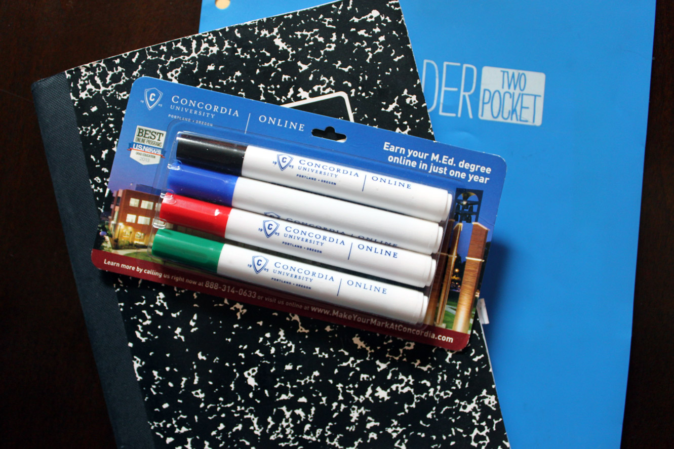
Direct Mail Campaign – Concordia University Project Direct Mail Campaign Goal Reach teachers in their classrooms Role Design As part of an integrated direct mail campaign, we partnered with a school supply company to send customized school supplies to school districts along with gift cards and an informational flyer for teachers to learn about our online masters and doctoral programs. The centerpiece of the package was a customized Dry Erase package that highlights Concordia University – Portland as well as various CTAs. Included with the package was a gift card where they could purchase additional school supplies of their choice. The biggest obstacle with this project was the very short turnaround time. We needed to submit all files for printing to the vendor within two weeks of the contract being signed. I worked with the vendor to ensure that all materials were printed and packaged correctly and on-time. Packaged with the Dry Erase markers was a vertical tri-fold flyer folded so that the promotional offer was visible. This flyer also highlighted the same CTA’s as the markers. We purchased a custom URL which redirected to a specified landing page for this campaign where teachers could request more information. Back to Portfolio
HotChalk Partner Network
HotChalk Partner Network Project B2B Website Goal Market HotChalk Partner Network to Charter Schools Role Scope, Wireframes, Design, Development and QA (aka: all of the above) The HotChalk Partnerships team needed a website to be able to establish new Charter School partners and showcase the Universities and degree programs available to partners. Under the HotChalk Partner Network brand and umbrella, I created a design that was both complimentary to the HotChalk brand as well as compelling to the target audience. The website is fully responsive making it accessible to all users. Previous Next Back to Portfolio


